How would you design an interface for a 1000 floor elevator?
Its not a 10% increase in complexity. Its 10 times as big.
This is a pretty broad question. Its simpler if we can distill down the scope of what we aim to do here:
- Are we talking about a single elevator that covers all 1000 floors or a system of multiple elevators each of which only runs between specific floors? Lets assume for our purposes that its a single, single-decker elevator. This helps us focus on the design of the interface instead of derailing into efficiency logistics. (Undoubtedly, a system of many elevators is going to be more efficient.)
- What kind of a building is this? Who lives here? Which companies work here? How many shopping malls / recreational areas are here? Are there any hospitals in this building? A 1000 floor building is potentially a whole city living inside a mega structure, so it is feasible there is everything a city needs (parks, schools, playgrounds, hospitals, theaters etc) within the building. Which means everyone is a user (kids, adults, people with vision / auditory / motor disabilities).
- What kind of requirements do we have on the size and speed of the elevator? Lets assume the speed to be around 22 mph (the Burj Khalifa’s top speed). This means it’d take around 8 and half minutes to get to the 1000th floor when travelling at top speed.
- Lets say its a biggish elevator, can hold around 50 people, probably has a few seats for taking rest, and a TV screen (separate from the interface) to help with all the waiting.
Now that we have a loosely defined structure to work with, lets kick things off with the first idea that comes to mind.
A thousand buttons
The elevator has a 1000 buttons, one for each floor. Pretty simple, its just an existing design scaled up. You press the floor # where you want to go. Lets see how many total buttons we might have :
- 1000 buttons for each of the floors.
- 2 buttons for door open and close.
- 2 buttons for emergencies (alarm and phone).
- A few knobs and switches for all the maintenance operations.
Lets take a look at the corresponding grid that would form:

Uh oh. Too long. Way too long, and it doesn't even take into account the open / close / alarm buttons yet!
If you were to print out this image to scale, it’d be taller than the height of an average human (or else you’d be dealing with very tiny buttons). So a 10*100 grid is obviously not practical.
Cons:
- You’d need a ladder if you were going to a higher floor.
- Its likely that a you’ll spend a good amount of time searching for the right floor button to press. A small pro although, is that you only need to press one button and you’re done.
- Its annoying when other people mistakenly press the wrong button and you have to wait for the elevator to stop at an additional floor. This will be a much bigger issue when the button grid is more than 10 times the normal size.
What if variations were a bit different? Would a different grid help us? What about a 20 * 50 grid? It might solve (just barely), #1 on the list above but #2 and #3 would still exist.
A better solution
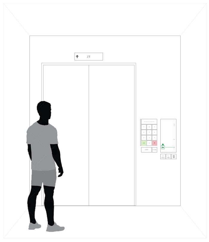
So if laying out all the floors doesn’t work, what other things can we do? There is an alternative. You could enter the floor number you want to go to, via a keypad just like in an atm machine. Definitely sounds better than having a thousand buttons. Lets see how this can potentially look like:

Lets break down the components here:
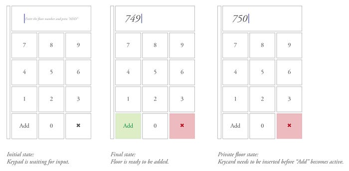
- Simple 12 button numeric keypad with a lcd screen above it. Type in the floor number you want to go to and press add.
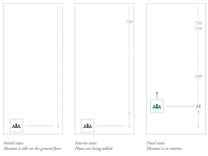
- A lcd screen to the right which shows a clear visualization of the floors the elevator is going to travel to. Pressing “add” on the keypad adds your floor to this visualization, giving you instant feedback for your action. Current floor is highlighted in a different color (like green in this mock).
- Door open / close buttons. The open button is intentionally bigger. Its one of the buttons I’m assuming a lot of people need to look for in a short amount of time (e.g. when some yells “hold the door!!” while its closing). Using clear type instead of ambiguous icons should be helpful here (the assumption being that its difficult to differentiate between the open, close icons).
- Keycard slot for private floors. (Assuming thats the system used in this building.)
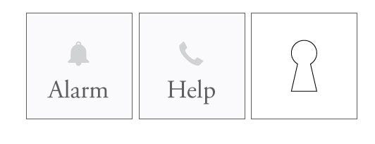
- Alarm, help buttons and a slot to insert the maintenance key.

The “Add” and “x” buttons on the keypad are color coded so that attention is bought to them when the user starts punching the floor number. I am assuming here that these elevators need a keycard access to private floors. An alternative could be that instead of a keycard (and thus the need for that dedicated slot), private floors are protected by a 4 digit pin. In that case the lcd screen would prompt you to enter the pin once you enter the floor number and press “Add”.

The LCD screen on the right could be potentially used to display more information. Things like the speed of the elevator or the estimated time to the next floor or the brand logo of the elevator company. I have excluded them from the design since they are not essential to the workings of the interface. Some questions might arise with the visualization I have used here for displaying the floors to which the elevator is travelling. What are the dots between the numbers? Each dot represents a floor, and as you keep adding floors from the keypad, the dot is replaced by the floor number. This gives users the feedback that their floor has been successfully entered into the system. What if someone adds in all 1000 floors? The text size of the display would simply scale down to accommodate all the 1000 numbers. This could also work as a fish-eye lens where the current floor (indicated in green) has a bigger text size than the rest of the list.
Other notes
- For this design I have chosen to go with physical buttons for the keypad and separate lcd screens instead of stuffing an ipad as the do-it-all screen. Low maintenance interfaces might be preferred in a building where you have a 1000 floors and 1 elevator being used by potentially tens of thousands of people daily. Physical buttons (provided they are made with high quality materials) should prove to be less fragile compared to a capacitive touch screen.
- I have chosen to go with as little iconography as possible so as to keep the interface clean and simple. Which is a good thing if every visitor in this building speaks english. If this is a building where people from different parts of the world are coming in and out daily, I would modify the design to include icons.
- A similar reasoning goes for braille and audio feedback. I have excluded them from my designs as it helps keep a much cleaner look, but its something to consider given the type of user base.
- I haven’t included any means of canceling a floor that you added in by accident. I feel its not going to be a common enough issue to warrant taking up real estate on the interface. If we needed it though, there could be some options.


I won’t go into much detail about the emergency and maintenance buttons, as I really don’t know which ones are essential and which ones are not. I have excluded any “call cancel” button from this design as I wasn’t totally sure its needed. Any buttons or knobs that are reserved for maintenance, I’d suggest being put away behind a hidden panel which can be opened by a key that the maintenance crew carries. These are buttons which are used rarely and it helps keep the interface clean. I have positioned these buttons at the very bottom because in case of an emergency you’d want anyone to be able to access these buttons, and that includes small kids (although I agree, its not fun when kids walk in and playfully press every damn button in the elevator..) Also note, I added in icons to these buttons and positioned them far from the rest of the buttons in the interface to make sure they stand out from the pack and are never accidentally pressed.
To wrap things up, lets put the design in perspective :

Pros
- A simple, clean, minimal interface, despite having to provide support for a thousand floors.
- Accidentally pressing wrong floor buttons is less likely, given the explicit nature of having to press “Add”.
Cons
- You now have to press a minimum of 2 buttons to get to any floor (compared to 1 button in my 1st solution).
Overall, this solution works well for what it is, a quick way for multiple people to navigate between a large number of floors. Of course, if I was looking to actually implement this in real life, I’d go the multi elevator, double decker car route for efficiency purposes. Although that might not make a significant difference when it comes to using the interface I propose. Ultimately, its the question that needs more structure to it. Depending on the nature of use cases, the interface to operate the elevator(s) can vary.
